Nightingale Design System Takes Flight

“A design system acts as the connective tissue that holds together your entire platform.”

Drew Bridewell, Invision

Project Overview

Faster and overall higher quality releases

Facilitating smoother handoff and quicker design/development based on central source of truth

Credible design language as a key market leader

Ensuring our product’s UI and visual language establishes us as a market leader amongst our competitors

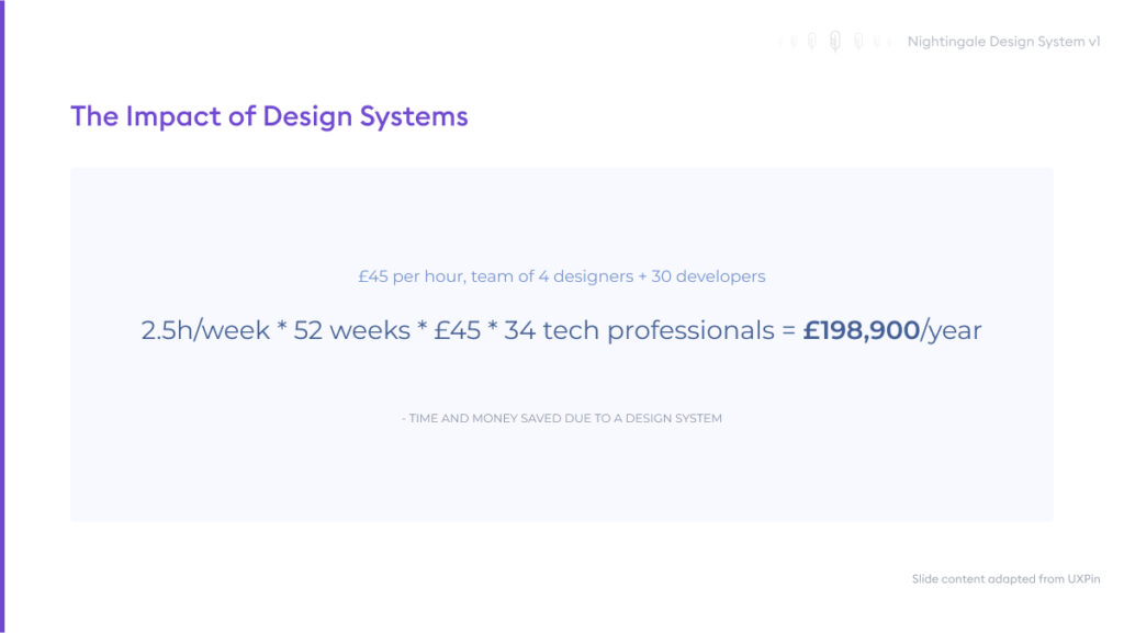
Saving ~£200k on design debt and discrepancies

Fewer inconsistent builds, rework and front-end bugs = saving ~£200k annually in dev/design costs

Introduction

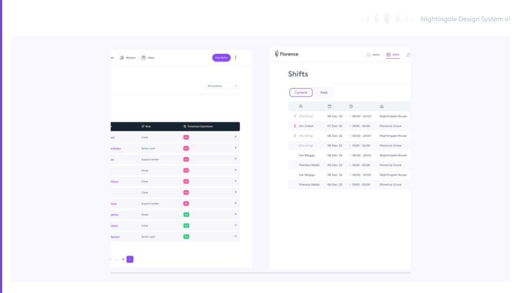
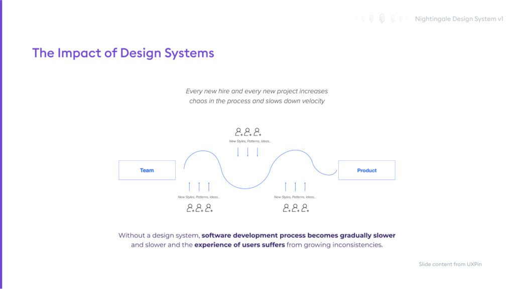
In early 2022, I identified a pressing need for a design system to remedy the growing inconsistencies in component usage and design language throughout our Florence social care offerings. This would shift our focus from simply building and releasing to also defining and governing efficiently. A well-established design system would be able to address our inevitable growing pains, both internally and externally, for the long-term betterment of product and process.

The Team Behind the System

As part of this evolution, I hired another designer who would contribute to the core workstream but also take ownership of Nightingale’s documentation and day-to-day maintenance, with my guidance throughout. In summer 2023, we made an exceptional hire with the right skillset suited to documentation, detailed design work, a strong and growing understanding of Figma and the appetite to continually maintain an organised system which could otherwise easily descend into chaos.

To further buy-in and crucial technical collaboration, we formed our Nightingale team consisting of several front-end developers alongside design. Shared workstreams and check-ins would facilitate key discussions and technical understanding between both sides, as well as keep the entire product team informed of upcoming or new changes. We also actively discussed how we would maintain our evolving process moving forward, which was currently split between Figma and Notion.

Securing Buy-In

I knew that introducing a design system for existing products is (notoriously) challenging, and often in unique ways, but with high returns. For Nightingale, this initial process meant identifying usability patterns, high-level goals both of design and the wider business, and devising scalable efficient methods which recognised design/dev capacity. As part of my vision for design maturity at Florence, Nightingale would be instrumental in design-dev handoff, streamlining delivery of features, maintaining consistency through visual hierarchy and voice, and freeing space for higher value user-centred conversation.

First though, buy-in. Initially, I had underestimated the scale of effort needed for generating buy-in across the business, assuming most people roughly knew what a design system was. Thankfully I was able to recognise this error early on through curious conversations in the office kitchen, with fleeting conversations about the ‘what, why, how’ around Nightingale. I understood then, and through ongoing research, that it was best to treat Nightingale as its own product with collaboration and input from across the organisation.

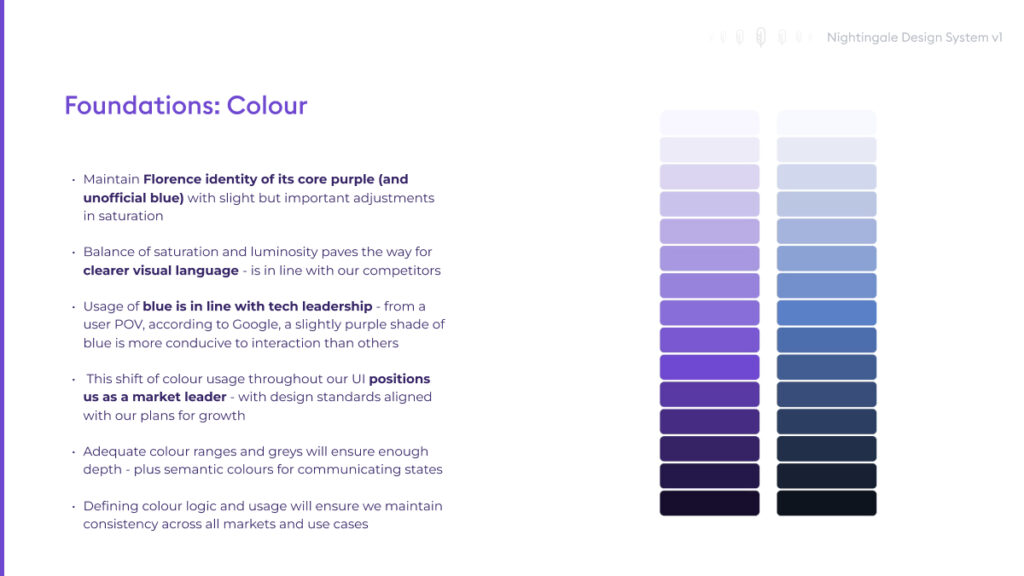
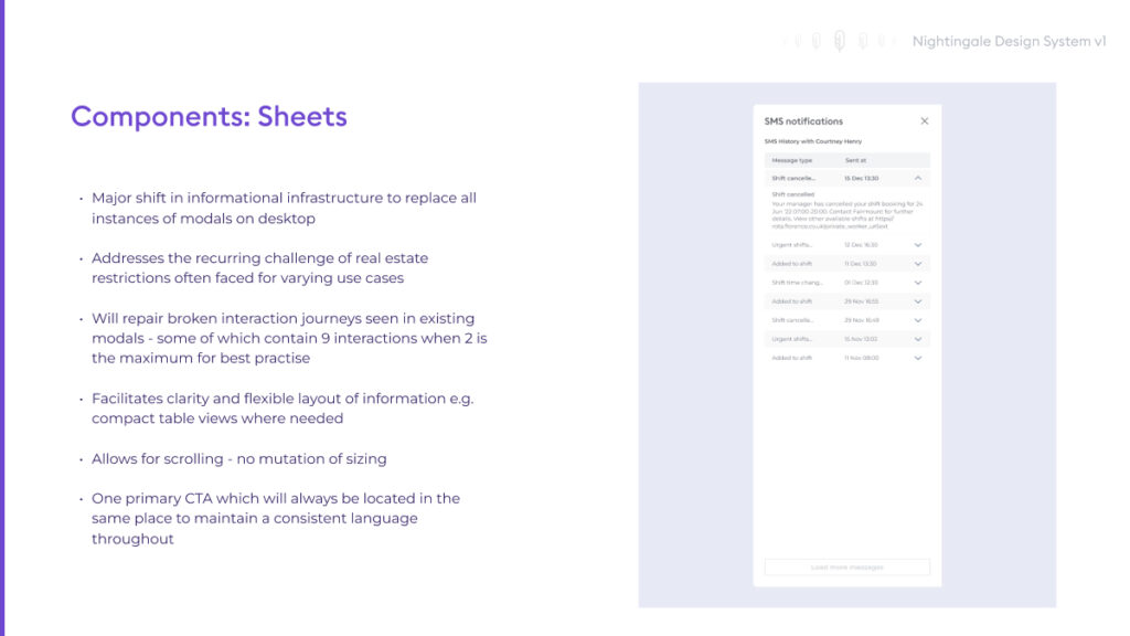
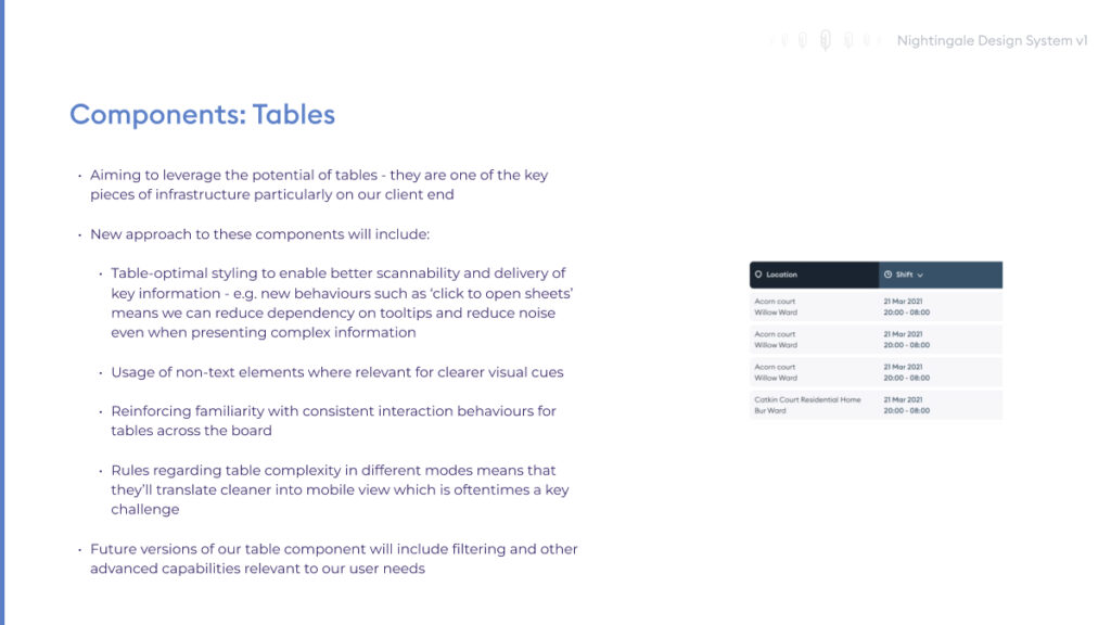
Addressing this, I created a rough buy-in strategy for Nightingale. For ‘launch’, we kicked off with our very first ‘Nightingale Pulse’ session (deck and blurry photo attached) which would later be used for a bi-quarterly updates on the design system. Pulse aimed to unify the different product squads and skillsets, and enable us to not only showcase pending and new developments, but also discuss Nightingale from different angles, answer questions, raise concerns and build a culture of ownership across the teams.

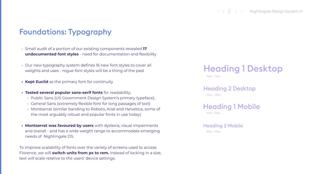
Following this, we’d also share org-wide micro announcements in Slack regarding exciting component news, releases, sometimes fun yet useful in-office testing rounds such as our sight font legibility test, where we enticed colleagues with a box of Lindt if they came to our testing station (the kitchen).

Build & Governance

In order to govern growth, communicate change and increase smooth handover to devs, we’d require a versioning system which would scale seamlessly and be easy to maintain, track and understand. Semver – more specifically, Semver versioning by module – would allow us to roll out smaller and incremental changes without disrupting an entire process. This would be alongside indicating changes within Figma, for on-the-fly updates for design and devs.

We eventually published Nightingale to Supernova, built and updated by our design system designer, and established it as an ongoing source of truth with in-depth documentation outlining logics, research, usage and variants. The team could also check the status of component builds, changelogs and release notes.

We Are Not FAANG

Importantly, design systems should grow with an organisation. If you’re not Spotify, you most likely do not need v1 to be something the scale of Encore, and most enterprise level orgs do not have the resource to build and maintain it. Recognising this, I invested time into an internal component audit which would inform us of priorities, urgencies and what changes we could afford to delay for version 1 to ensure a smooth initial rollout.

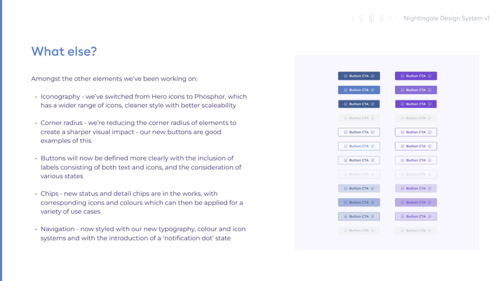
It was clear very early on that components were not being built robustly enough to scale for different scenarios, and/or new components were regularly being created on-the-fly. An example of this is button behaviours where many variants of a component would exist throughout our products, but without any supporting documentation or logic.

This staggered rollout would enable us to test and review our design system process for larger releases moving forward.

Launch & Debut

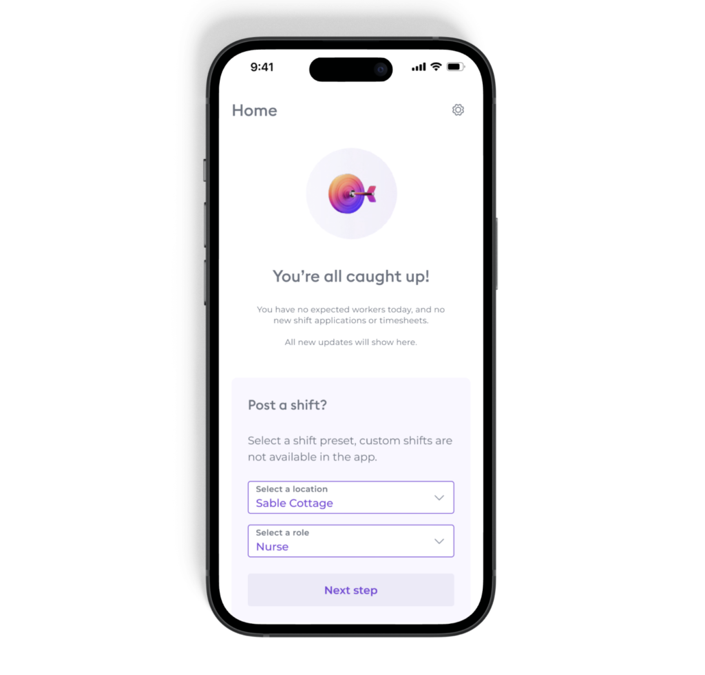
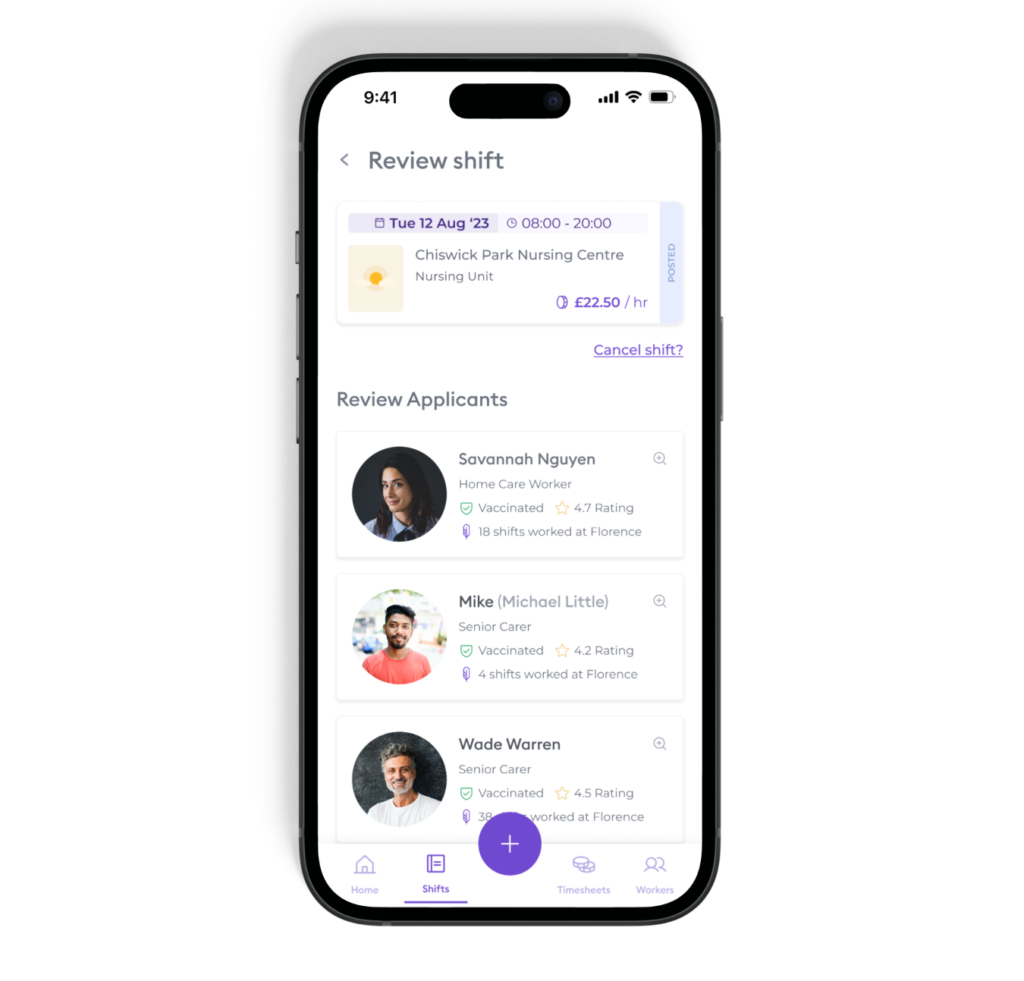
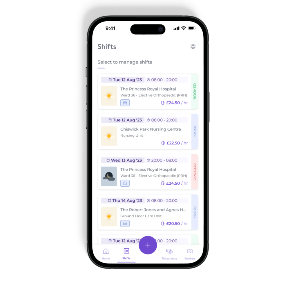
The new Florence B2B mobile app for clients was the first launch which adopted Nightingale from the get-go. Not only has feedback for the UI has been overwhelmingly positive (see also an official case study from Hansel Foundation here), but has drastically improved the ease of designing, building and introducing new features into this cleaner space now also properly governed.

“The app is simple and easy to use, it dispelled all my fear of using apps.”

– Jane C, service manager with Florence